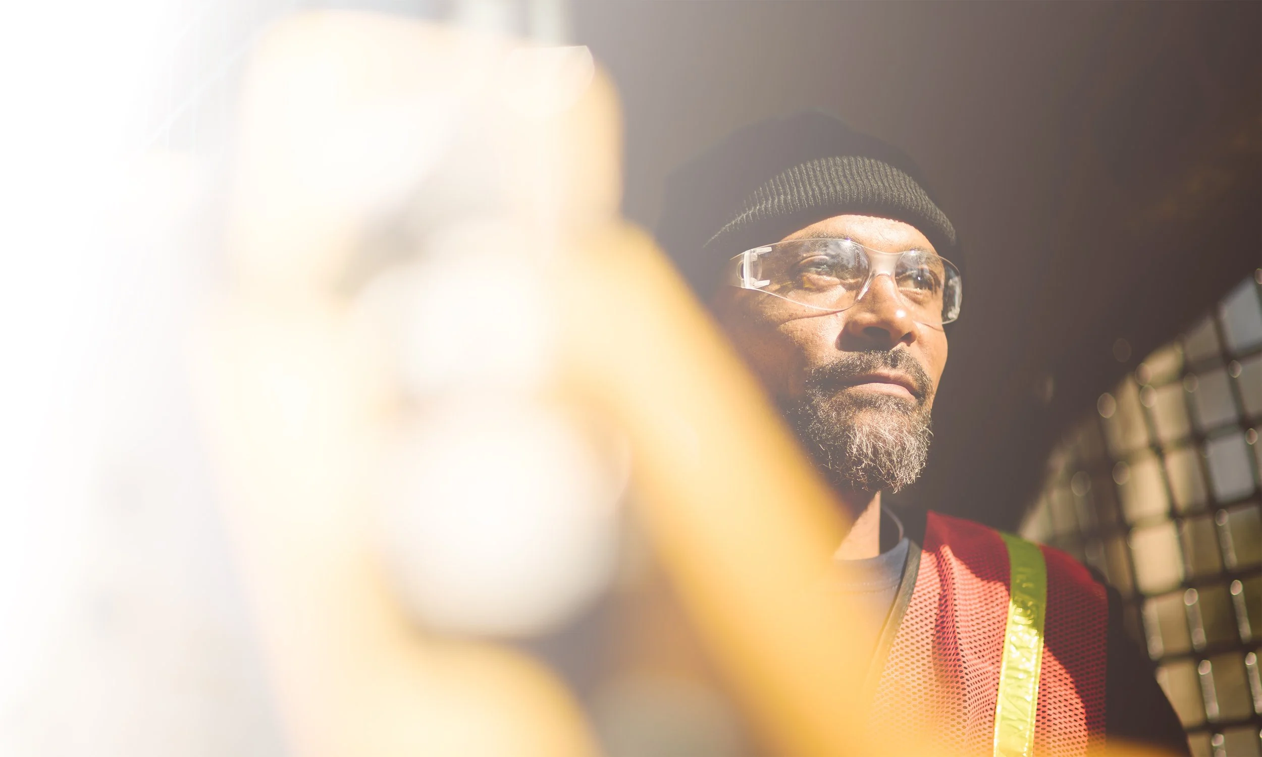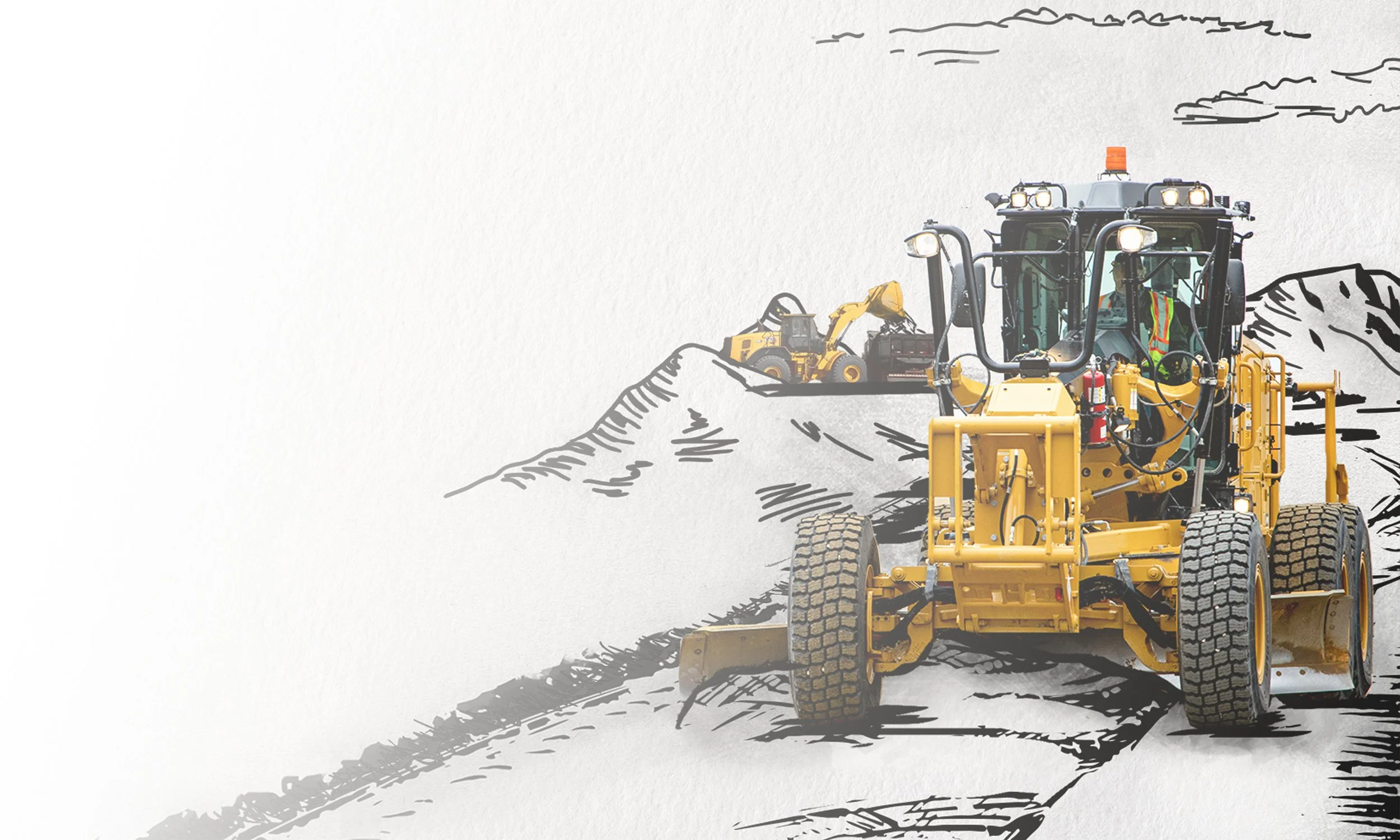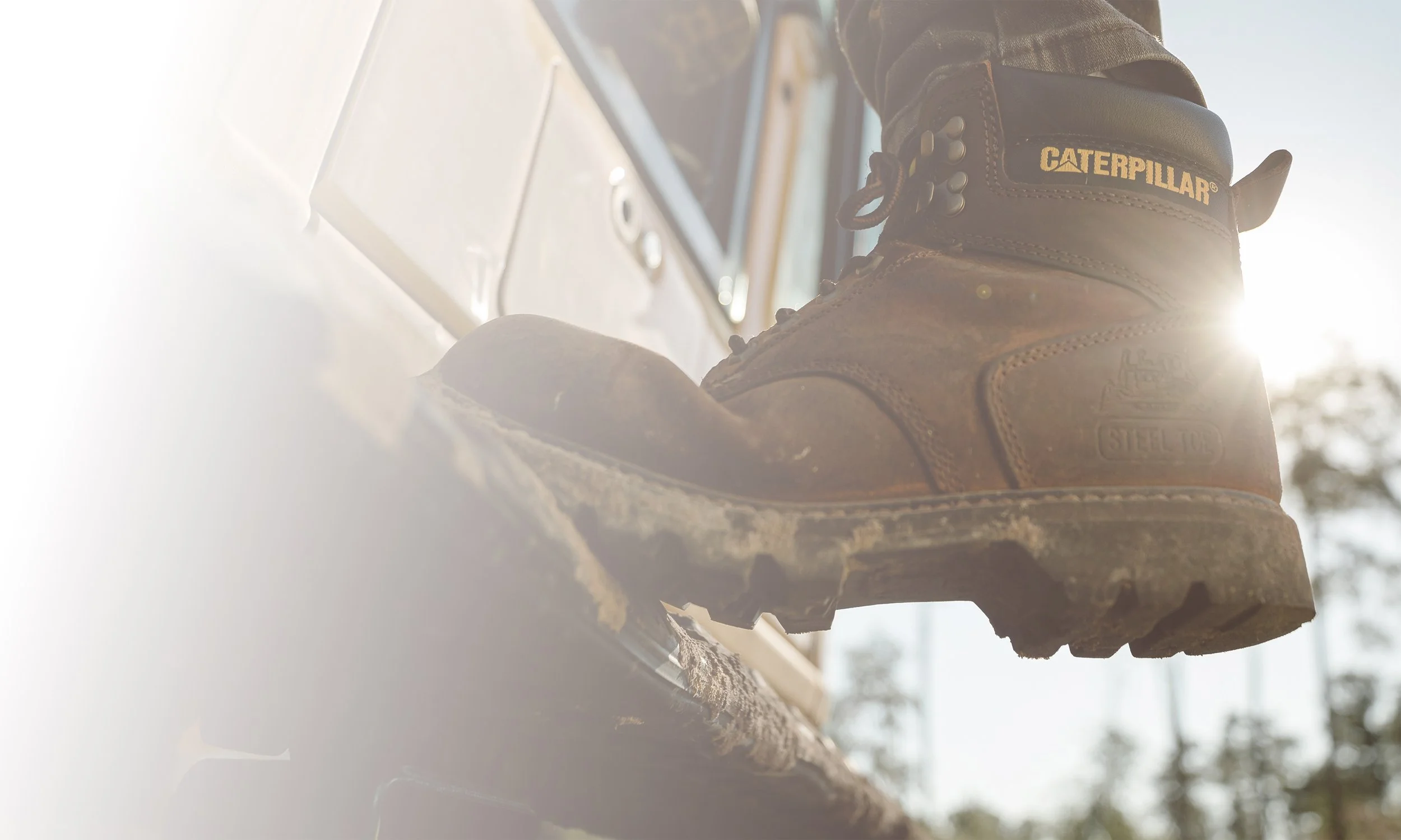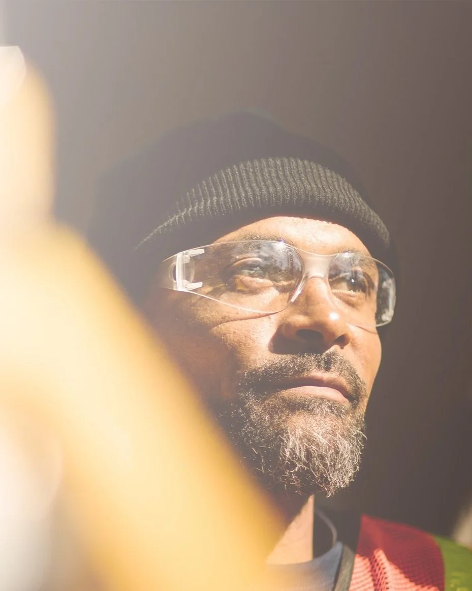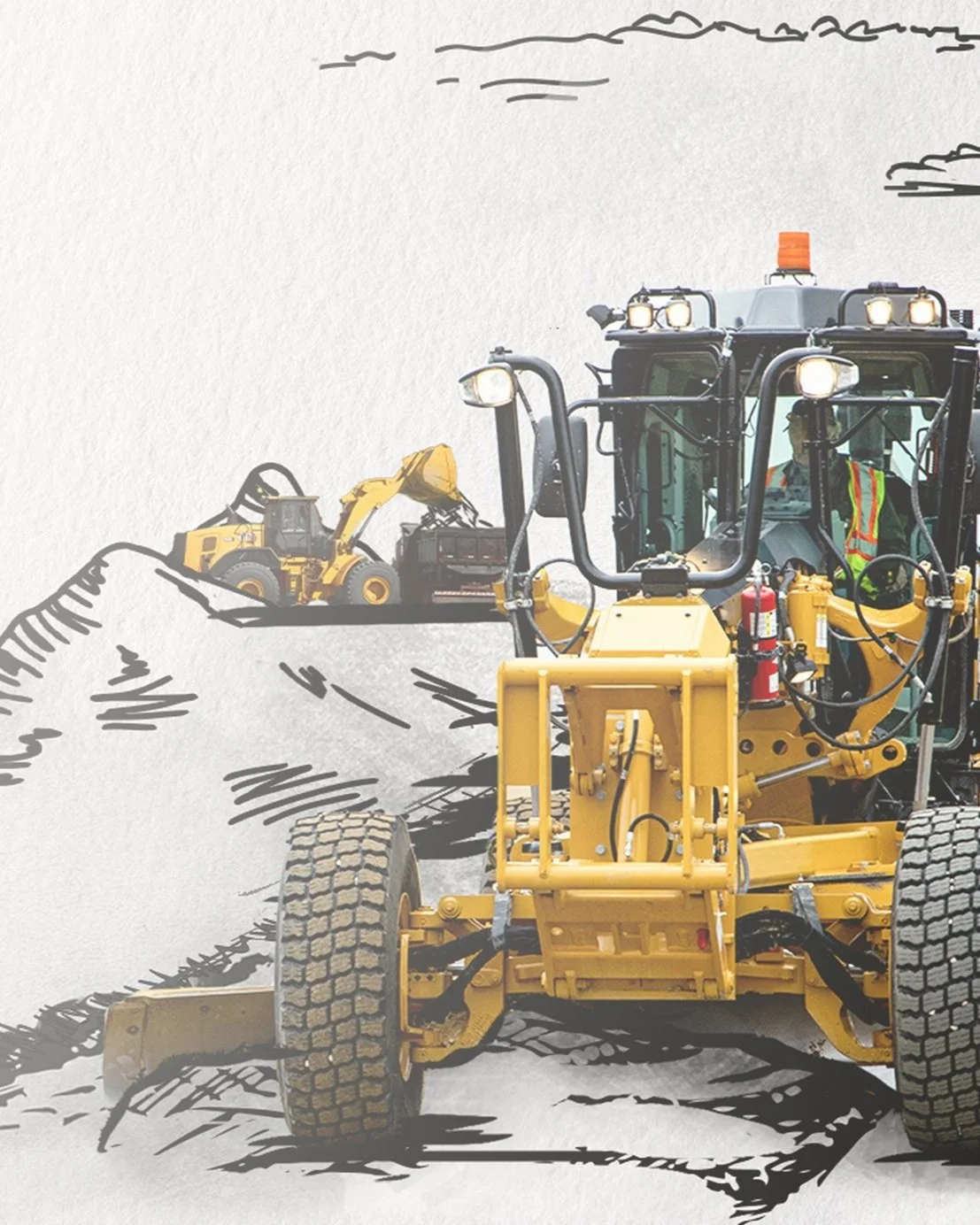

Daily Grind

Brand
Central.

Brand
Central.
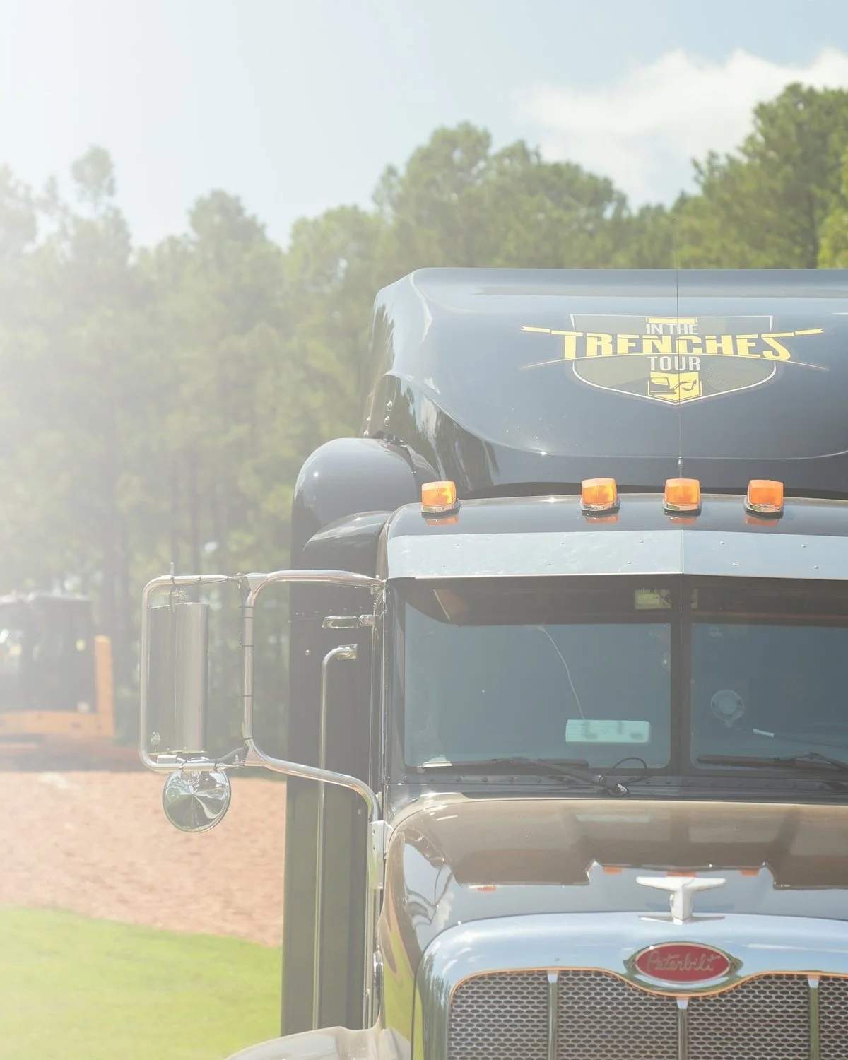
Rebrands, product launches and side-hustles, oh my!
They can’t all be career-defining, globe-trotting, budget-busting blockbusters. Outside of Caterpillar, I’ve done about a million other projects that have kept me up at night, and excited in the morning.
The other half of my career has been spent in-house and working with other clients. Sometimes for entire campaigns, and sometimes just to provide a fresh set of eyes on a hot project.
Beyond the design, photography and direction lies countless hours of concepting, pitching, pre-production planning and strategic execution. Giving me a chance to stretch my wings, play with some alternate color pallets and bring back new ideas to my main gig.
INDEPENDENT HEALTH CAMPAIGNS
Age Appropriate


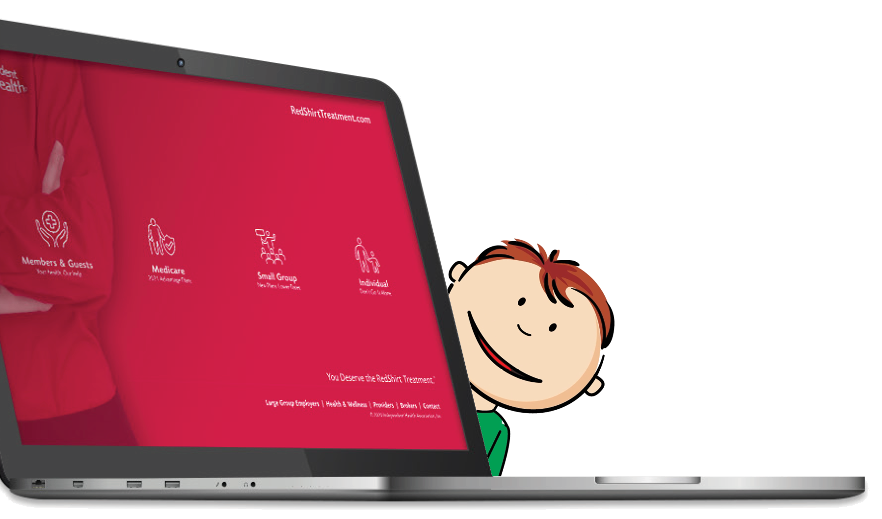
The healthy choice.
I've worked on a number of Independent Health campaigns over the years, but the ones that really stuck with me most were targeted at the old and young respectively.
Age-in is a yearly campaign that aims to help seniors bridge the gap as they enter the market for Medicare.
From kid-friendly, expert presentations to district-wide, school exercise programs, Fitness For Kids is all about getting kids moving.


THRED LAUNCH
No Loose Ends

A direct line to your healthcare.
Launching a new healthcare product into an already growing telehealth market in the midst of a pandemic? Smart.
Bringing me in to concept, direct and execute. Well, I think it went pretty good.
At the height of COVID, Independent Health wanted a fresh take to help them launch a fresh brand. The problem? I was in NC, and they were in NY. And travel wasn't happening anytime soon. But we landed on a killer concept that exceeded the client's expectations. So I got to work with our producer and a killer production team to bring it all to life — mostly over FaceTime.
Even with a lean team, we built the entire brand from the ground up in a matter of months.


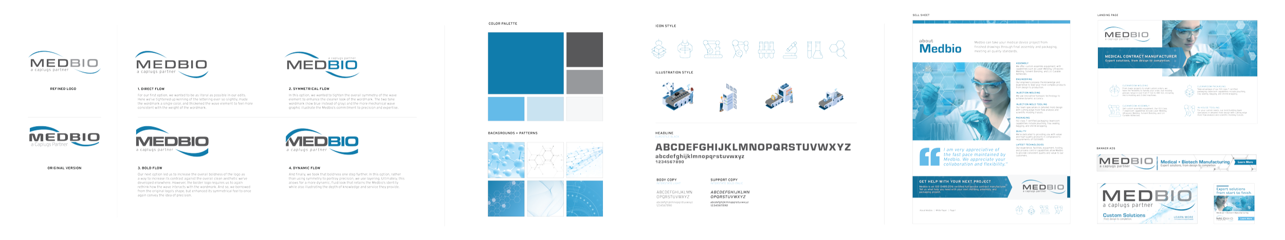
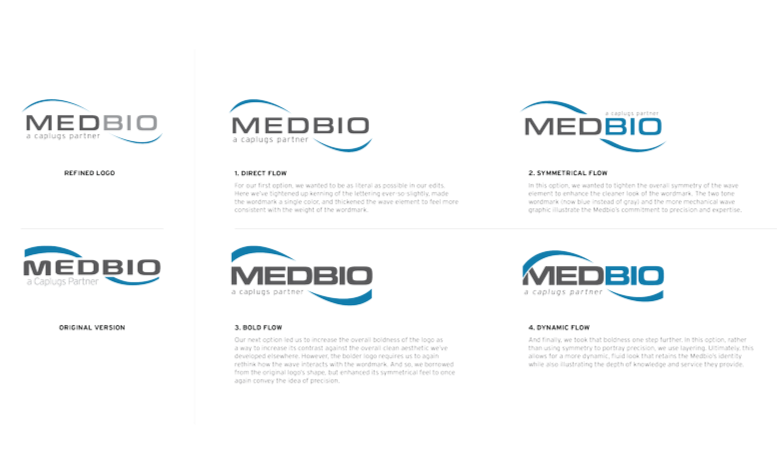
MEDBIO REFRESH
A Clean Start

A less sterile environment.
When their parent company, Caplugs asked us to bring Medbio’s marketing communications into the 21st century - little did we know that their service and production models were already few centuries ahead. While well-known in the medical manufacturing industry, communicating the breadth of their capabilities presented a unique challenge. They’re one of the only custom medical manufacturing companies in the world with the expertise, scope and footprint to support a global industry at, essentially any scale.
But their audience often had no clue.
And to top it all off, they had a bit of an image deficit. Being on the cutting edge demands a bit more elegance, after all. But rather than a full rebrand, they asked us help them cash in on their existing brand-recognition without undermining their perception in the market.
THE BRAND TOUR
MEDBIO REFRESH
A Clean Start
A less sterile environment.
When their parent company, Caplugs asked us to bring Medbio’s marketing communications into the 21st century - little did we know that their service and production models were already few centuries ahead. While well-known in the medical manufacturing industry, communicating the breadth of their capabilities presented a unique challenge. They’re one of the only custom medical manufacturing companies in the world with the expertise, scope and footprint to support a global industry at, essentially any scale.
But their audience often had no clue.
And to top it all off, they had a bit of an image deficit. Being on the cutting edge demands a bit more elegance, after all. But rather than a full rebrand, they asked us help them cash in on their existing brand-recognition without undermining their perception in the market.

THE BRAND TOUR
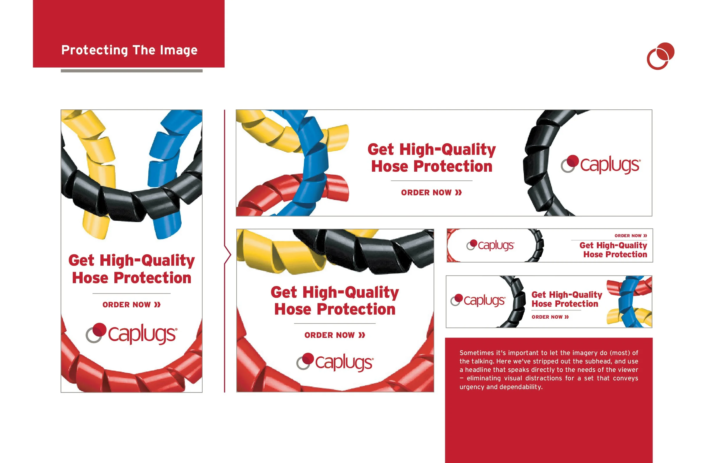
CAPLUGS CLEANUP
Put A Cap On It
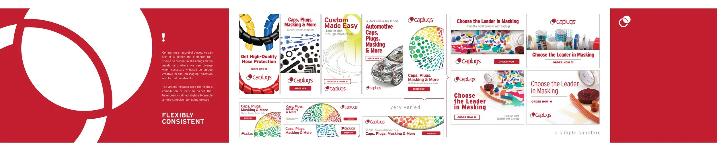
All plugged up.
Caplugs is a curious client. A global leader in their industry, but a bit hesitant to shake things up. And notably literal in their marketing materials.
But they had a consistency problem, and I love a challenge.
With hundreds of thousands of SKUs, a multitude of applications, dozens of of product lines and too many cooks — their brand identity was being muddied up. So they brought me in to lead the cleaning crew — solidifying an unwieldy array of constantly updating marketing materials, and sometimes, just to make the client a bit uncomfortable.
AUSTIN HOSE REBRAND
The Pressure's On
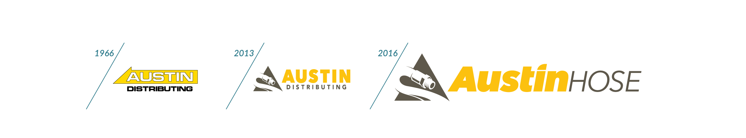


Crimping my style.
This is where I cut my teeth.
Not my first job, by any means, but the first one where I'm actually proud of the work I did. I got a ton of unique opportunities I wouldn’t have otherwise, and was able to really come to understand the industrial B2B space. And as luck would have it, I started in the company's 49th year — just in time to lead a complete rebrand.


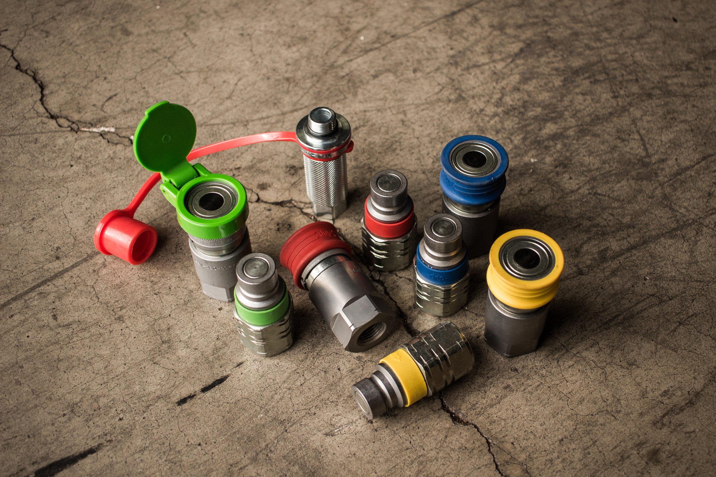
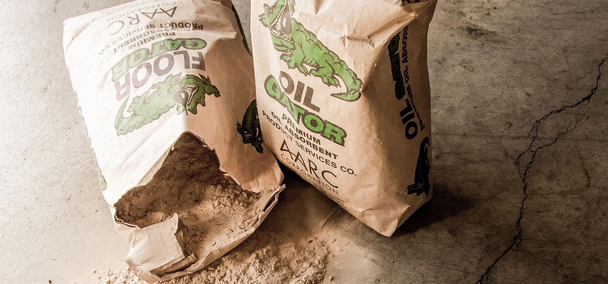
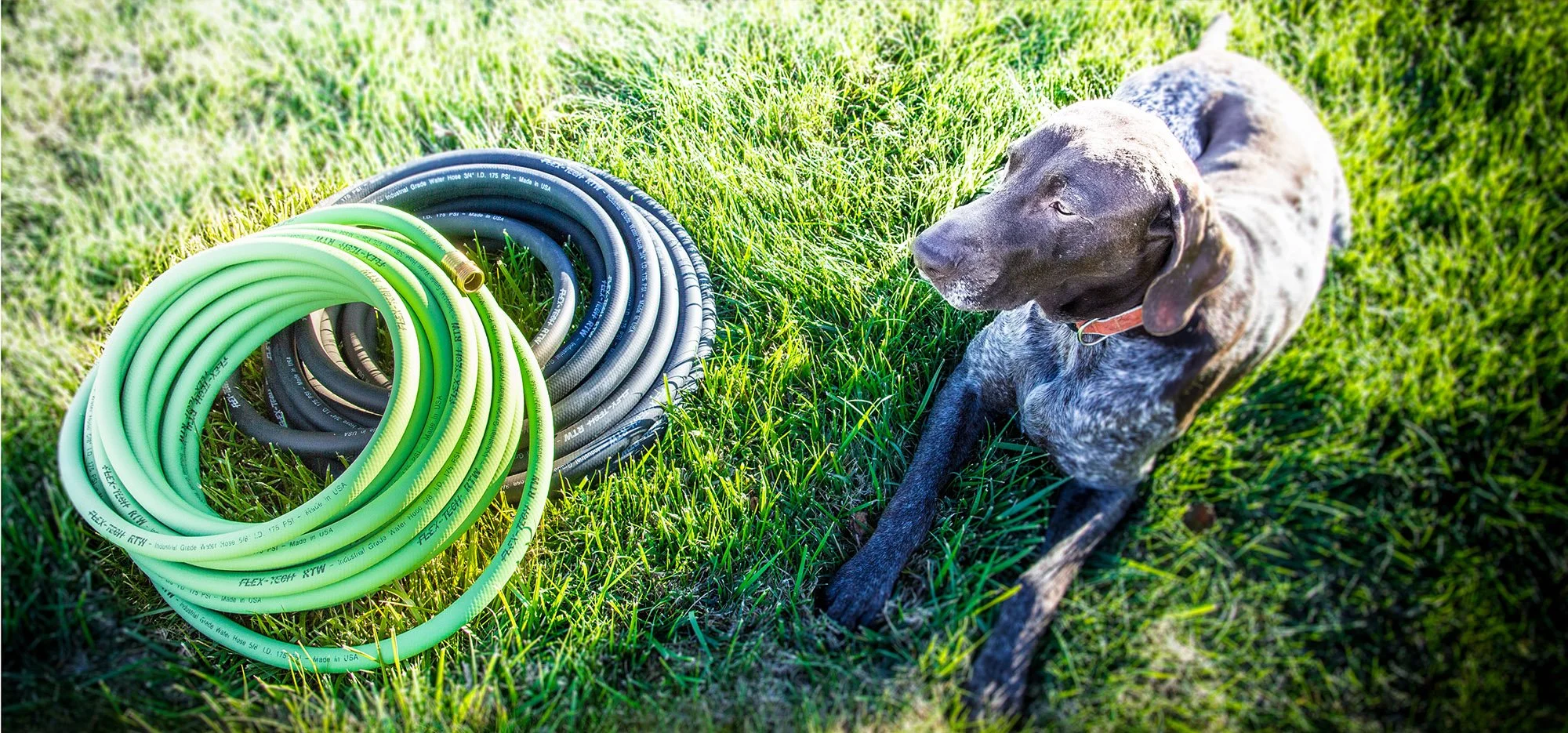
AUSTIN HOSE PRODUCTION
Anything Hose
PLANTING A SEED
A CUT ABOVE
Graphic designer
Motion designer
Product photographer
Web designer
Web developer
Layout designer
Packaging designer
Experiential designer
Signmaker
Concept artist
Illustrator
Accountant (just making sure you’re paying attention)
Videographer
Drone pilot
Producer
IT sometimes
Voiceover artist
Copywriter
Editor
Director
CLEAN FREAKS
Finding my fitting.
This is also where I realized how much I love the process.
I wasn’t just the graphic designer. I was the marketing guy. Not that I had any clue what I was doing, mind you. That’s just how it is at small, family-owned business sometimes. It’s a great way to learn though. And I certainly learned. I had to. Like how to manage a brand. How to identify and target untapped markets. Or how to how to set up a tripod.
I did it all — often to middling results, maybe. But I did it.
Graphic designer
Motion designer
Product photographer
Web designer
Web developer
Layout designer
Packaging designer
Experiential designer
Signmaker
Concept artist
Illustrator
Accountant (just making sure you’re still paying attention)
Videographer
Drone pilot
Producer
IT sometimes
Voiceover artist
Copywriter
Editor
Director

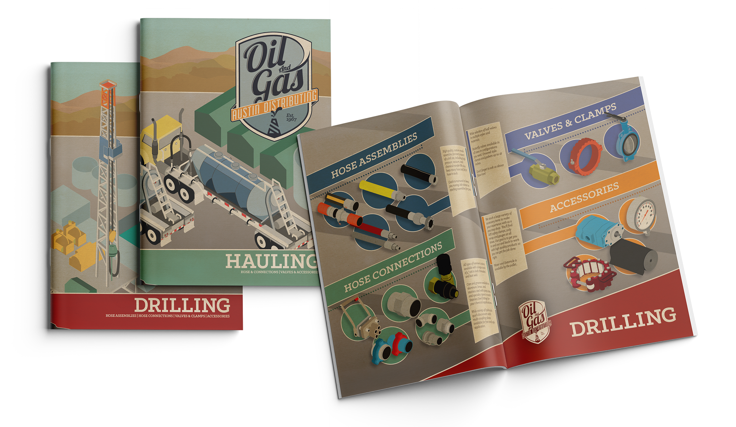
AUSTIN HOSE OIL & GAS DIVISION
Rig Something Up
DELIVERING THE GOODS


The pipeline to success.
I mentioned unique opportunities, right?
Well, Austin Hose went all-in — expanding their territory and expertise into the burgeoning Oil & Gas market. And creative budgets kept stretching right alongside our frequent flyer miles. From shooting on active rigs to developing and marketing an exclusive suite of industry-focused services, this was the first true taste I had of leading a massively successful campaign.


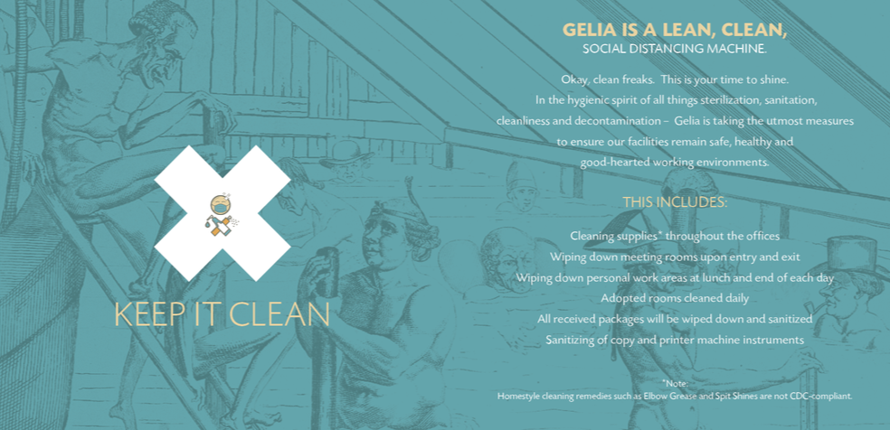
GELIA COVID MATERIALS
Masked Up With Nowhere To Go

We’re all mad here.
We were all losing our minds, and it certainly shows in Gelia's "Welcome Back from Quarantine" materials.
From the start, our goal was to make a real mish-mash that satisfied the buttoned-down account services types and the weirdo creatives.
I think we struck the balance.
For the basis, we searched high and low for the most obscure, strange and unusual public domain illustrations we could find, so we could ham-fistedly justify them thematically. Then we knocked 'em into the background, got overly verbose and put a nice corporate bow on it all with some fun animated icons.
GELIA COVID MATERIALS
Masked Up

We’re all mad here.
We were all losing our minds, and it certainly shows in Gelia's "Welcome Back from Quarantine" materials.
From the start, our goal was to make a real mish-mash that satisfied the buttoned-down account services types and the weirdo creatives.
I think we struck the balance.
For the basis, we searched high and low for the most obscure, strange and unusual public domain illustrations we could find, so we could ham-fistedly justify them thematically. Then we knocked 'em into the background, got overly verbose and put a nice corporate bow on it all with some fun animated icons.
Can’t get enough?
Get a load of these jobs.